Don’t Let Bugs Ruin Your
Interact With Your Product
Need to construct a striking item that is a moment win? We make significant encounters and transform them into substantial business results.

TechArt Turns On A Strong Groundwork, One That Is Based On Your Vision and Our Skill.
We apply cooperative, human-focused plan remembering to even the hardest of business challenges. With a tireless obligation to development and top notch craftsmanship, we convey the most gorgeous, significant and effective encounters for your clients.
TechArt Digital has a demonstrated history of conveying significant client encounters, opening the force of innovation inside associations, and invigorating development with bold new drives.
We're a full-administration configuration group. We'll do all that from giving you the scoop on what your clients need, to ensuring that you're conveying them what they need.
We are plan scholars, issue solvers and trend-setters offering high speed evidence of ideas to enormous scope configuration thinking-based help item plan to boost your profit from speculation.

Get Ready To Take Digital Control Of Your Business Data
User Research
We lead research on track clients to grasp their necessities, ways of behaving, and inclinations.
Interface Design
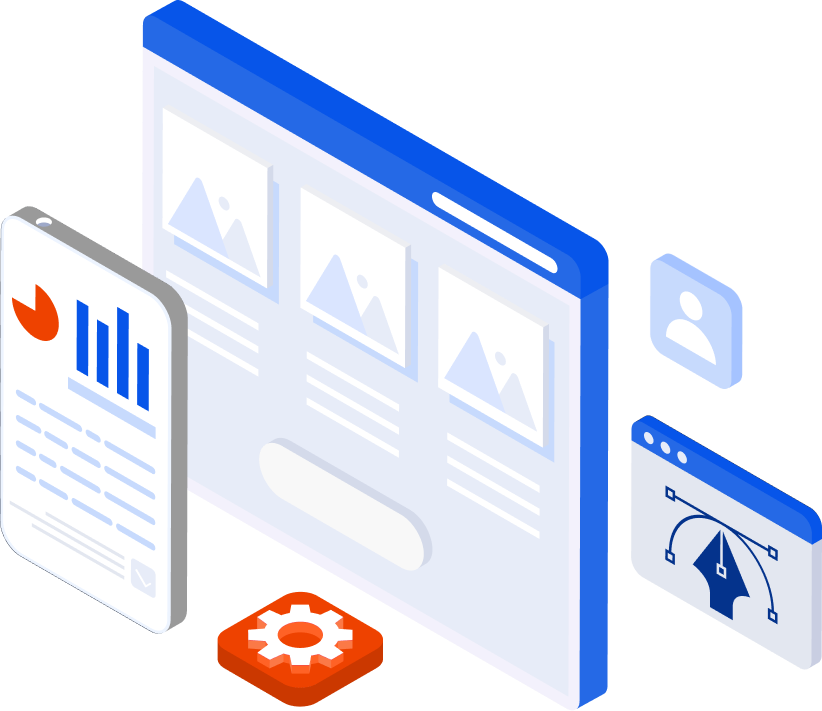
We plan the visual components of an item and make wireframes and mockups.
Interaction Design
We plan the collaborations and client streams inside an item, like route, fastens, and signals.
Usability Testing
We test an item with clients to perceive how effectively they can achieve undertakings and recognize any issues or regions for development.
Prototyping
We make a functioning model of the item, which can be utilized for testing and exhibition purposes.
Design System
We make a bunch of plan rules and parts that can be reused across numerous undertakings, to guarantee consistency and effectiveness.
Design Strategy
We work with clients to comprehend business objectives and client needs, and make a plan that lines up with those objectives.
Design Consulting
We give master counsel on plan related issues to assist clients with settling on informed conclusions about their item.
1
Explore Together
- Identifying major pain points
- Goals to be achieved
- Competitor analysis
2
Define Strategy
- Design Strategy
- Use Cases
- Paper Wireframes
3
Build & Iterate
- Interactive Prototype
- System Assets & Specs
- UI Style Guide
Customers Reviews
What Our Clients Say


Get In Touch
We Provide Best Services,
Need Help?
Frequently Asked Questions
Dedicated to Helping You Succeed!
- info@techartdigital.com
-
TechArt Digital
1270 South Alfred St. #1064
Los Angeles, CA 90035
Get In Touch
All Right Reserved | www.techartdigital.com


